Shopping cart abandonment: How UX design can improve conversions
Feb 10, 2021 19 min read
Shopping cart abandonment is a common theme in the world of eCommerce.
Shopping cart abandonment is a common theme in the world of eCommerce. In fact, 88.05% of online shopping orders are abandoned by customers. This creates a crucial problem for online merchants, who are constantly looking for new ways to boost conversion rates and increase sales.
In this article, we’ll discuss everything you need to know about shopping cart abandonment, from its many causes to the different steps your company can take to recover from it. With a heavy emphasis on the role of UX design, we’ll show you how to decrease your shopping cart abandonment rate, increase conversions, and boost revenue.
Shopping cart abandonment—as the name suggests—is when an online shopper begins the virtual checkout process, but does not complete the purchase. Ecommerce companies use cart abandonment rate as a key performance indicator (KPI) to help track the overall performance of their website.
Here is a quick glance at the average shopping cart abandonment rates for specific industries:
As you can see, shopping cart abandonment is an issue that plagues eCommerce businesses across a wide range of industries—with hotels, consumer electronics, and retail sitting closest to the average. To bring your company’s abandonment rate down, you first need to understand what causes customers to leave your site before completing the checkout process in the first place.
There are countless reasons for an abandoned cart, many of which can be avoided with a solid UX design for both desktop and mobile. Certain situations are out of your control, like the customer suddenly losing internet access or simply getting distracted during checkout.
According to recent studies, these are some of the most common explanations for abandoned carts.
Simply put, shopping cart abandonment means fewer sales and conversions for eCommerce companies. Every instance of a customer not completing a purchase on your site represents a missed opportunity for your business. As these instances add up, the loss of revenue can be devastating. Research shows that online merchants lose $18 billion in annual sales due to cart abandonment.
So how much revenue is your business losing each year because of unfinished purchases? It’s important to be aware of your website’s cart abandonment rate so you can see how it compares to your competitors, and begin making plans to optimize your UX.
Calculating cart abandonment rate is easy. Just divide the number of completed transactions by the number of shopping carts initiated, subtract that number from one, then multiply by 100:
1 – transactions completed/ shopping carts initiated X 100 = cart abandonment rate
So, if you have 500 shopping carts initiated and 200 transactions completed, then your cart abandonment rate will be 60%.
Now that you know how to determine cart abandonment rate—in addition to its causes and effects—let’s dive into the various approaches to solving this problem.
As discussed, shopping cart abandonment occurs for every online store, which is why your business must be prepared with a shopping cart recovery strategy. You’re not going to be able to bring your abandonment rate down to 0%, but you can take actions to motivate customers back to your site, either to complete the checkout process or continue shopping at a later time.
Shopping cart recovery is typically accomplished using these two methods:
In situations where the customer enters their email address before leaving the site, you can send an email enticing them to complete the checkout process. Studies show that abandoned cart emails produce an average conversion rate of 18.64%.
In the email, there should be a link to the initiated cart, so the customer can easily pick up right where they left off. Also, consider including a discount or coupon code to give the customer even more incentive to return. With the help of certain plugins and tools like MailChimp and CartBounty, you can have abandonment emails sent immediately and automatically.
By placing a marketing pixel—also known as a tracking pixel—on your checkout page, you can deliver personalized ads to cart abandoners on other channels, such as Google and Facebook. In other words, the user receives an ad for the exact product that was in their cart before leaving your site. This helps to keep customers from forgetting about your brand as they continue browsing the web.
Retargeting has proven to be a very effective response to cart abandonment. In fact, 75% of consumers visually engage with retargeted ads. And 26% of those consumers will click on the ad, taking them back to your site.

To keep customers from leaving your site, you need to provide a superior user experience (UX). So the first step in preventing cart abandonment is enhancing your UX design, specifically as it pertains to checkout. By optimizing the checkout experience, you can potentially increase conversions by 36%.
Here are the most effective tactics for decreasing your shopping cart abandonment rate:
When buyers enter their credit card details on your site, they need to be assured that you, the merchant, are keeping their personal data safe. If there is any hesitation around privacy and security, customers will likely leave before providing payment.
A good way to establish trust is by including security logos—such as the “Norton Secured” logo —on your checkout page to remind customers that they are in good hands. Without providing visual proof of payment security, you’ll certainly experience more abandoned carts. 61% of consumers agree that if security logos are absent during the checkout process, they will not complete an online purchase.
Guest checkout—a feature that 59.4% of online retailers now include in their checkout process—allows customers to buy products without having to create an account on the website first. Marketers like having customers create accounts before making purchases because it helps them collect valuable data.
However, many users view this as an annoyance and will leave before providing their email address, phone number, and other personal data. Guest checkout makes the whole process move much faster, which means fewer abandoned carts and more sales. For the best results, give your customers the option of choosing between guest checkout and creating an account.
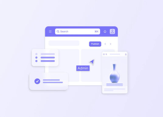
Providing customers with a visual indicator of how far along they are in the checkout process will alleviate buyer anxiety. The goal here is to show the customer what step they are on, and how many steps are left, so that they understand how much longer the process will take. This establishes a feeling of comfort, especially among super busy shoppers who want to get in and out as quickly as possible.
Like the progress bar, displaying thumbnail images and links to cart items will make your customers feel more comfortable throughout the checkout process. For buyers in the middle of a serious shopping spree, thumbnail images help them remember what they’re buying and whether or not they are forgetting something. Also, if they’re having second thoughts about an item and need to double-check the details, they can easily click over to the product page. These subtle features can make a huge difference during those critical moments when a customer is on the brink of abandoning their cart.
When an online shopper puts two $5 items in their cart, they’re going to expect to pay $10 (plus tax) when it comes time to checkout. So if they are suddenly presented with additional fees and shipping costs, they’ll likely get frustrated and leave.
You can avoid this scenario by being upfront about pricing from the beginning of the buyer’s journey to the moment their transaction is processed. This is especially important when it comes to shipping, as unexpected shipping costs account for 28% of all abandoned carts.
Let’s say a customer is in the checkout process, but then decides they want to buy more stuff. Your site’s UX should facilitate a simple transition from cart to store, and vice versa. Improving your site navigation starts with understanding what things to avoid. For example, a consensus among eCommerce experts is that if users ever have to click the “Back” button, then the site navigation probably needs to be redesigned.
Did you know that over half of digital shoppers will bounce from a webpage if it takes three or more seconds to load? And as the eCommerce industry becomes more competitive, consumers are only becoming more impatient.
Sluggish sites are bound to experience higher abandonment rates, so it’s important to constantly check your page load times to ensure everything is running smoothly. There are many reasons for slow loading times, from unoptimized images to a faulty load balancer.
A well-placed CTA button can help push customers along in the checkout process. Many online stores don’t include checkout CTAs on their pages, with the assumption that a customer wouldn’t add an item to their cart unless they intended to make the purchase. By providing a simple “Checkout” button on each page that takes customers directly to the payment form, you can speed up the process and boost conversions.
One of the benefits of online shopping is that—unlike brick and mortar stores—you can leave your cart filled with items and return at a later time to either checkout or continue shopping. Allowing your customers to take full advantage of this benefit will help improve your conversion rates.
One way to do this is by requiring users to sign in to their accounts to access old carts. Though, as discussed earlier, this can turn customers off and motivate them to shop elsewhere. By utilizing browser cookies, your site can remember specific customer carts, so the checkout process can be completed during a future session—without the user having to provide login credentials.
A/B testing—the process of comparing two different versions of a web page to see which performs best—is a crucial element of UX design. Many of the strategies on this list, like displaying a progress bar and including checkout CTAs, should be thoroughly A/B tested before being fully implemented on your site. As you learn about new methods for improving your UX, try out different checkout processes and compare them side by side to figure out what produces the most conversions.

While the tips above serve as a good starting point, every business requires its own unique approach to resolving the issue of shopping cart abandonment. To develop and implement a strategy that works for your website, turn to a team of web development and UX professionals who understand what it takes to thrive in the increasingly competitive world of eCommerce.
Here at Codal, we specialize in UX design that facilitate seamless and engaging customer experiences, so online merchants like you don’t have to worry about customers getting bored or frustrated with the site before making a purchase.
We start by learning everything we can about your business and your customers. Then, we put together a team of expert developers, designers, analysts, and testers who will turn your dream online store into a reality.
With over a decade of experience helping brands succeed in eCommerce, a thorough understanding of new and cutting-edge technologies, and our partnerships with eCommerce giants like BigCommerce and Shopify, we’re always up for a new challenge.

Explore our latest expertise on innovation, design, and technology, or connect with us directly to see how we can help accelerate your digital transformation.
