
When we talk about UX, we’re almost always referring to websites, apps, or software—modern technologies that have shaped the human experience since their invention. But in reality, ‘UX’ isn’t anything new. In fact, it’s existed for as long as humans have been designing, inventing, and creating. Quite a bit has changed since then.
But not everything.
Take one of the most familiar tools in UX design, a theory so fundamental it’s one of the first things we teach our children. A ubiquitous fixture in art that has existed for hundreds of years, yet remains as relevant as ever today—especially in the realm of user experience.
I am, of course, talking about the color wheel.
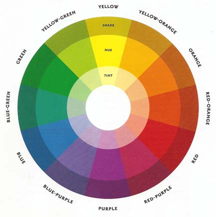
An effortlessly simple guide to using color effectively, understanding the color wheel is imperative to being a well-rounded UX designer. It’s a time-tested tool, but today I want to pair it with another model, a much more contemporary one that you may not be familiar with.
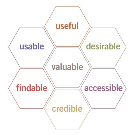
This is the UX honeycomb, a visual model created by designer Peter Morville that delineates the seven key components of optimal UX. Premier UX design companies adhere to this model to ensure their websites have these essential traits for an ideal user experience.
When I first came across the UX honeycomb, it reminded me a bit of the color wheel, another indispensable tool of the designer. Perhaps it’s no coincidence that the number of colors in the rainbow and the number of characteristics of excellent UX are one in the same.
So I thought I would marry these two diagrams by describing the impact color has on just a few of the tenants of the UX honeycomb. An understanding of this impact leads to the realization that color is an essential factor of your website, and it cannot be ignored.
Desirability
Perhaps the most obvious application of color in the honeycomb, it’s no secret that the appropriate color can elicit a powerful emotional response, like desire, from the user.
We inherently connect color to feeling; so much so that we have injected that association into our language. Like when we’re feeling blue, or are green with envy.
While there’s no catch-all color to evoke “desire”, it’s simple to select colors for your web design based on the nature of your business, and the kind of feelings associated with each color. Take a look at the color cheat sheet below.

A UX Designers Color Cheat Sheet
The graphic above is more than simple reference guide. It explains why so many fast food companies (McDonald’s, Wendy’s) use red—it elicits immediacy and hunger, the pillars of the fast food industry.
It explains why banks and airlines use blue to evoke trust and stability, and why Cadbury and Hallmark prefer purple to paint themselves with an especially dignified image.
Each business uses an appropriate color scheme to evoke the emotion they want their target audience to feel, thus making themselves more desirable to the consumer.
One thing this graphic is not, however, is set in stone. While it provides an excellent set of guidelines, it does ignore a crucial facet of color theory as it pertains to UX: humans perceive color differently.
I’m not referring to an individual’s preference—research has shown that men and women fundamentally see color in differing ways.
One study found that men preferred darker websites to women, which may be intuitive. When men were asked what they liked about the darker colored websites, they used words like “fun” or “amazing”.
Yet when the women who preferred the darker websites were asked what they liked, they gave descriptions like “professional”, or “elegant”. Most of the men and some of the women were drawn to the darker websites—but for completely different reasons.
Another reason the above graphic is a guide, and not a steadfast rule: color can be wielded differently to strengthen other characteristics of the UX honeycomb. Don’t just pick a scheme for your website based on association, and ignore the rest of what color has to offer in UX.
Usability
Color in UX design is much more than just evoking feeling from the user. It also plays a pivotal role in the usability of your site.
In one of the more obvious applications, use contrasting colors to make a button, menu, or any other CTA stand out. Remember the color wheel—if your site is doused in shades of blue, use blue’s direct opposite on the wheel: a conspicuous orange.
Remember the other inherent meanings we give color: red is an error, a “something’s gone wrong”. Yellow is more cautionary, and green of course, is “proceed”, or “you’re good”.
Look below how Houzz uses green to highlight their clickable buttons, creating a more usable interface.

Another great example is when websites employ a lack of color to increase usability, like J.Crew’s product pages. Using a snow-white site background and various off-whites for the product image backdrop, the colors of their clothes pop.

Accessibility
An oft-forgotten aspect of UX design, it is essential your site can be easily accessible to all customers, including those with a condition that affects 1 in 12 men and 4.5% of the entire population: colorblindness.
Take a look at the color scheme used in the call-to-action below.

The first image, on the left, seems okay, right? Maybe it’s not the most appealing pairing of colors, but the contrast is there—nobody is going to misunderstand this button.
Nobody, that is, except those with red-green color blindness, the most common form of the impairment. The image on the right is what the button looks like to a person who is colorblind.
That, my friends, is a UX disaster.
Another design pitfall to avoid is explicitly referencing the colors on the page. For example, “the required fields are highlighted in yellow” is going to be extremely frustrating for someone who has difficulty discerning yellows.
A general rule in UX is to design for ALL users, and when it comes to color, that includes the colorblind.
Does This Color Look Good On Me?
We’ve covered just a few of the UX honeycomb’s characteristics: desirability, usability, and accessibility. Color may play a more critical role in these facets of UX than others, but that doesn’t mean color can be ignored at any part of the design process.
At the end of the day, the right colors for your site will be dependent on one thing only: the users. They are the ends to our design means. That’s why so many UX design agencies do such thorough research on users—they are the ones we must answer to.
So remember to weigh your color options, consult UX experts, and listen to your users; because choosing the right colors for your website is never black-and-white.


